How to Talk Paper
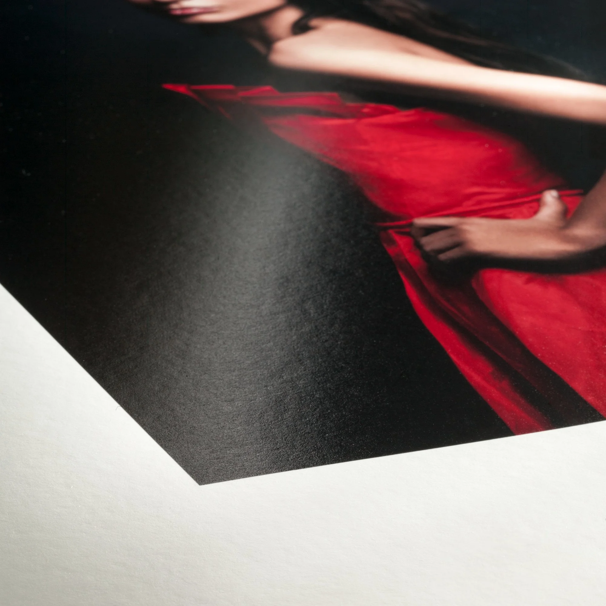
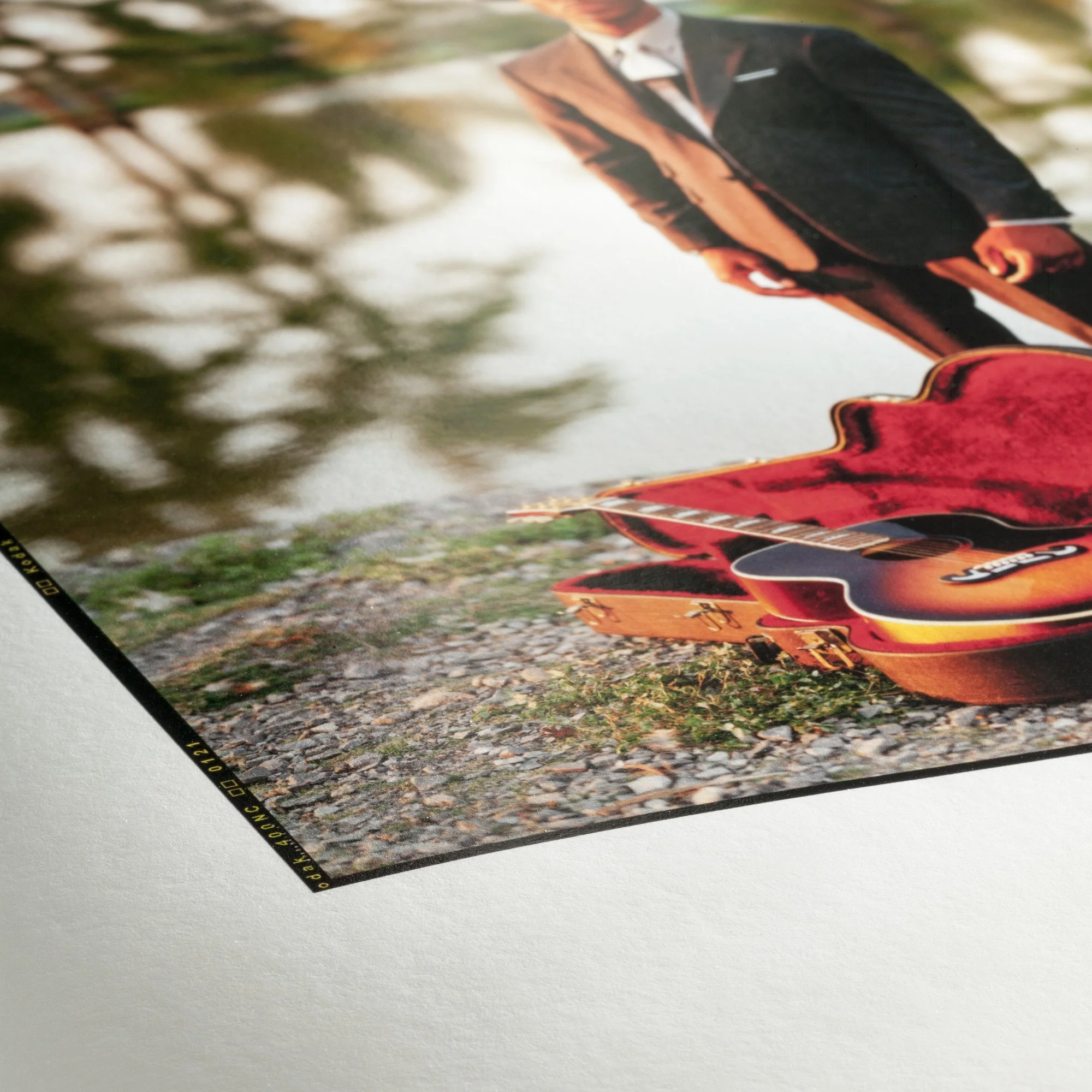
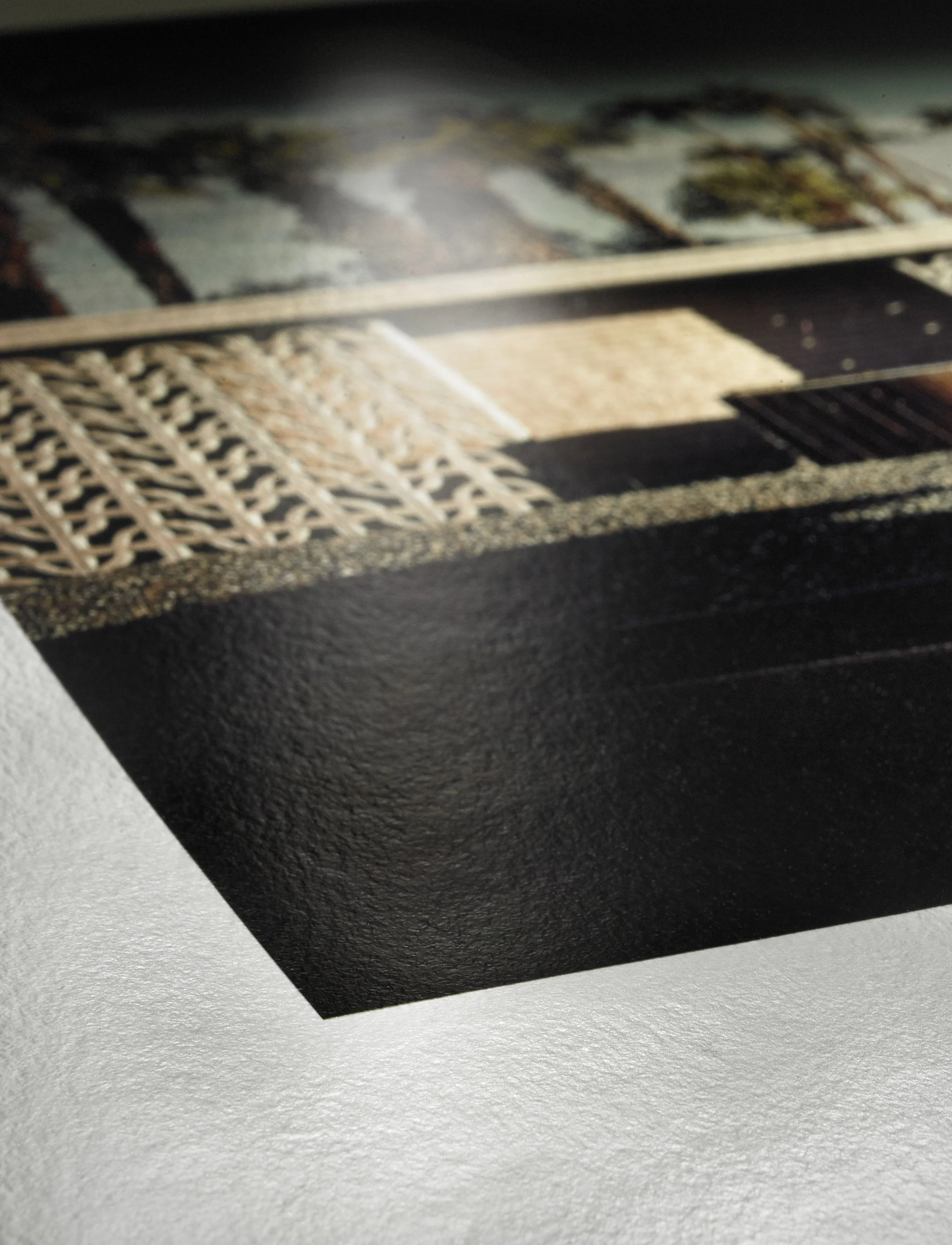
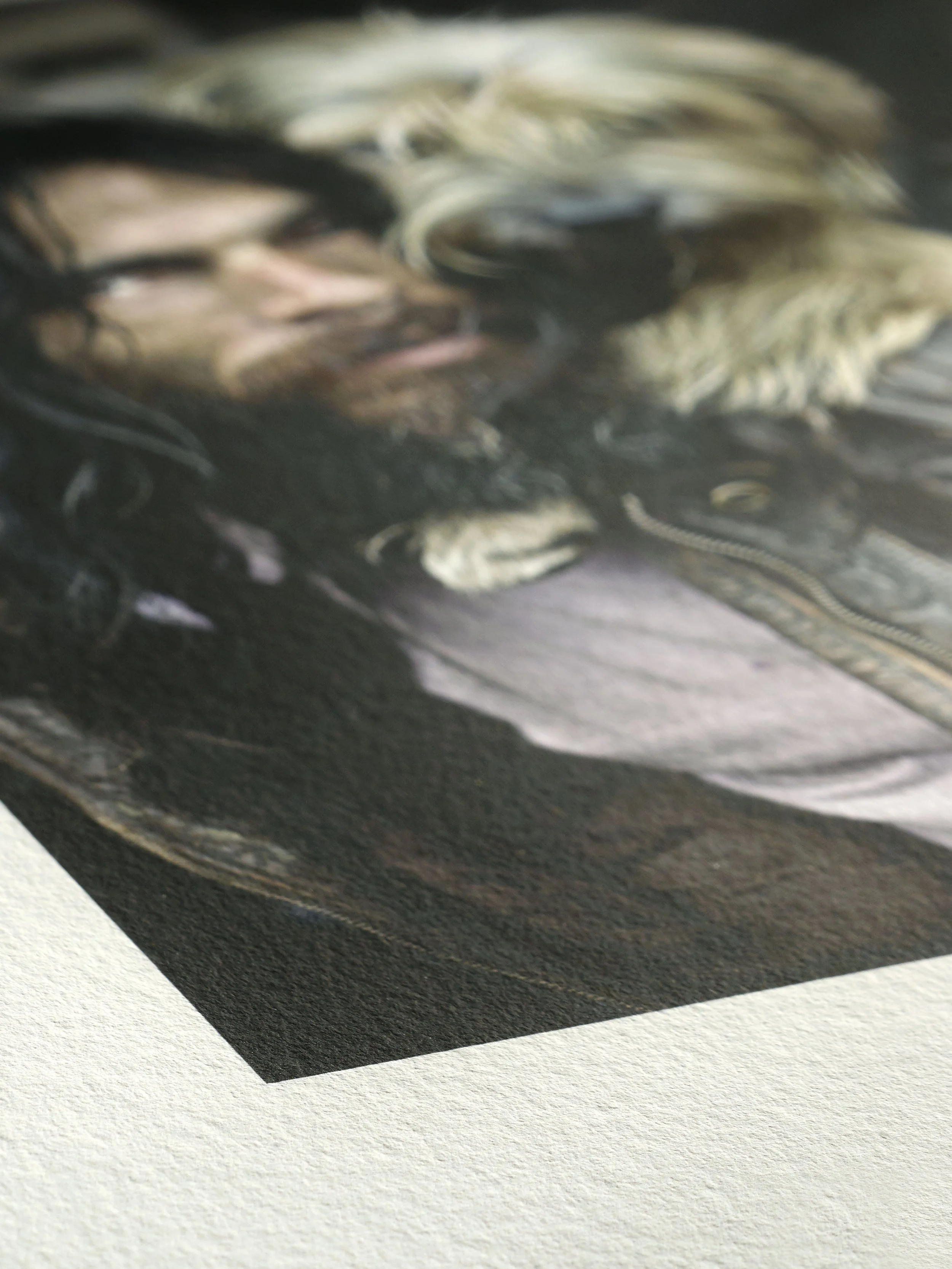
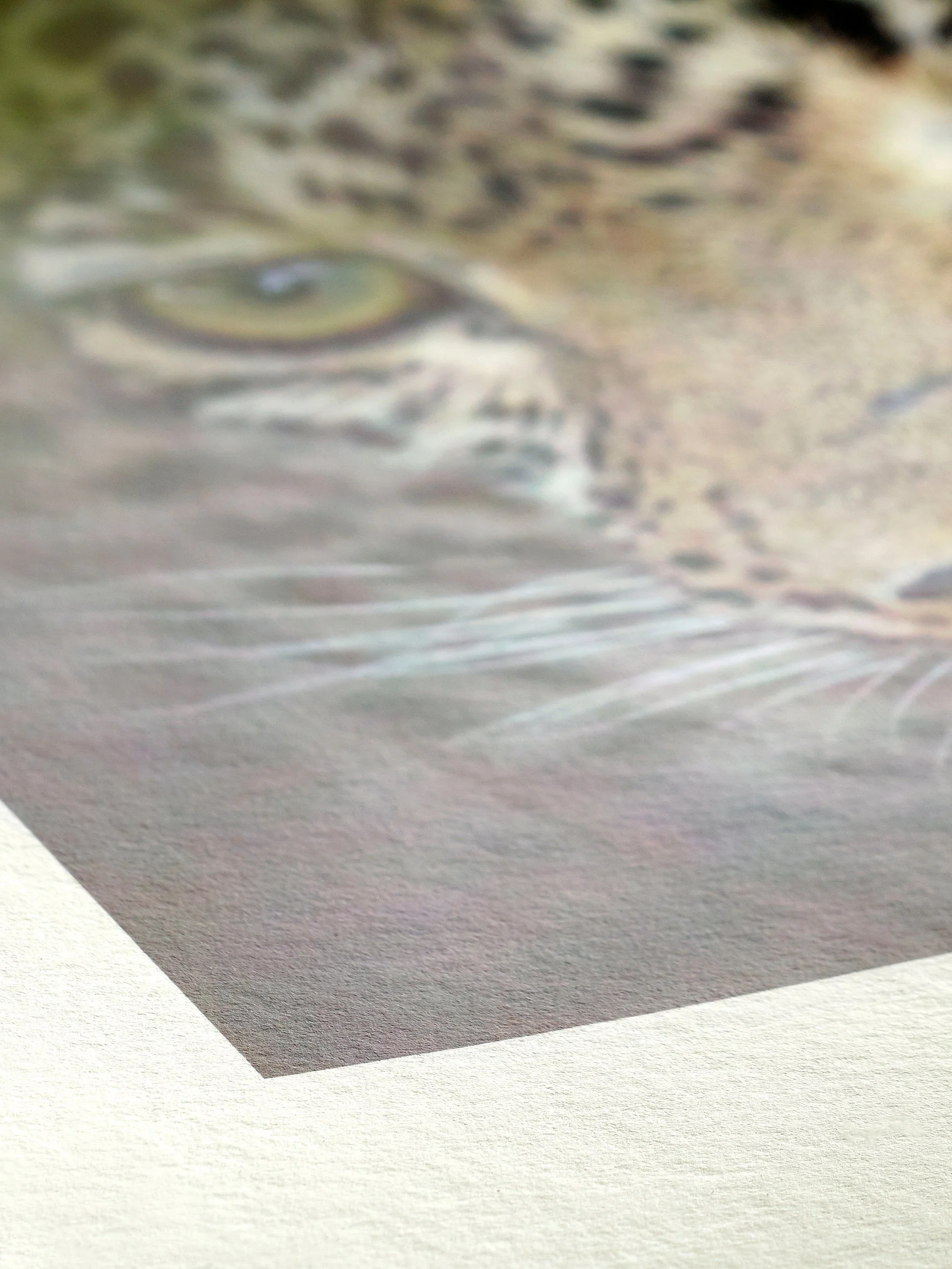
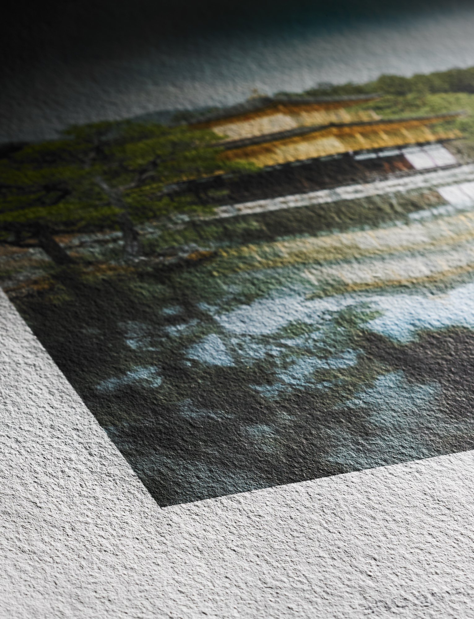
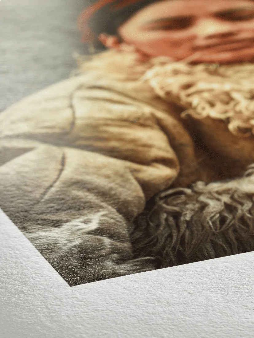
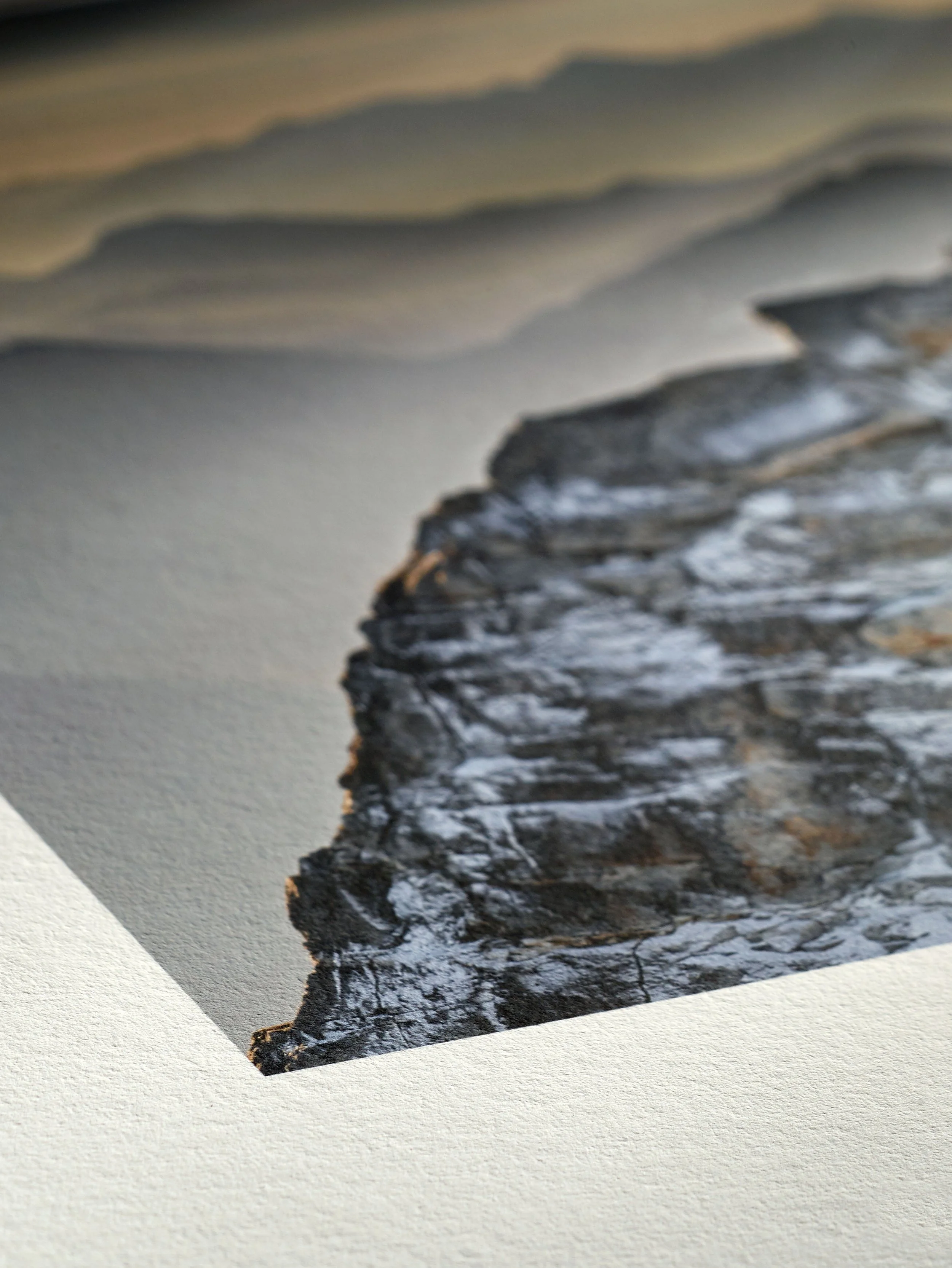
My last post provided an introduction to myself as your writer and to the goals of this blog. Today for my first official discussion I thought we would start with something that will permeate every future discussion throughout this blog. That of course is how to talk about paper, and prints in general. When you look at a print, how can you describe what you see? When you're looking for a specific style of paper, how do you describe it? If you're unhappy about a print how can you convey accurately what the issues are? With my first few months as a professional printer under my belt, if one thing has become clear to me it's that people including artists, photographers and printers like myself struggle to understand all the technical jargon that printing and paper companies toss around. Today I will do my best to go through some of the most common terms used when printing.
Photo Paper vs Fine Art Paper
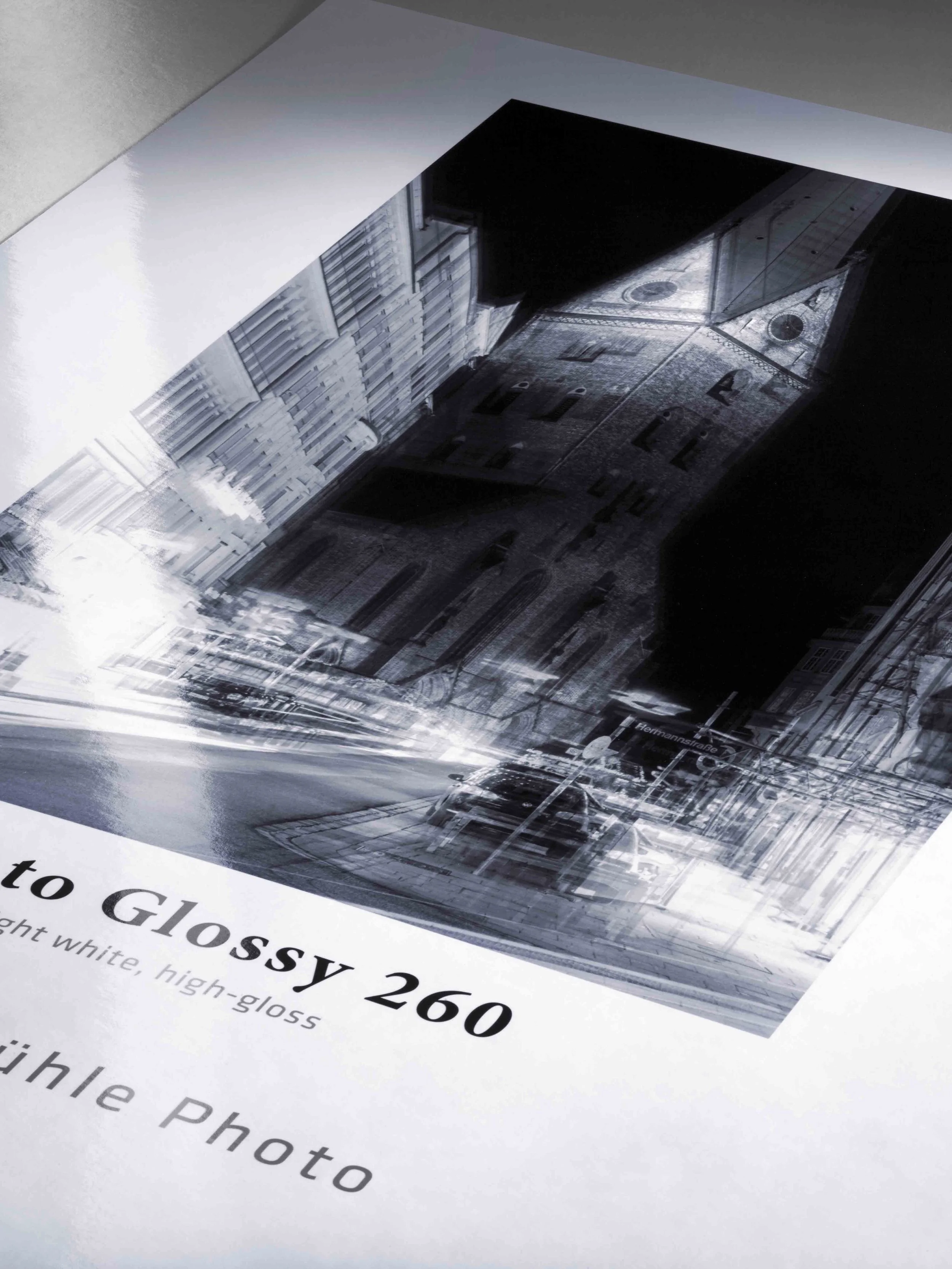
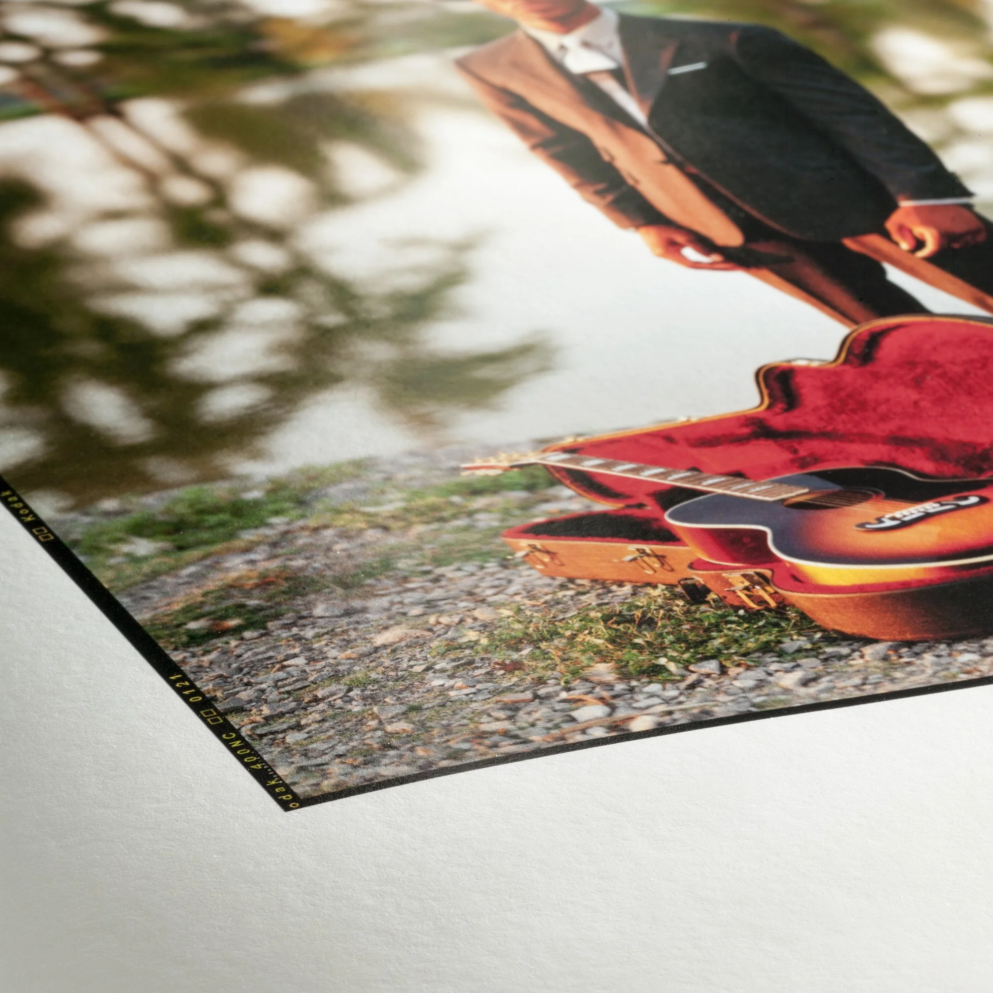
First, lets start with the two overarching terms Photo Papers vs Fine Art Papers. These are two terms that are often used when discussing different papers but what are the differences and the pros and cons of each. The difference between the two actually lies within the composition of the paper itself, which leads to numerous differences between them .
Photo Paper, also sometimes referred to as Resin-Coated Paper (RC Papers), is where an alpha cellulose (wood pulp) base paper has a polyethylene layer extruded on both sides. This allows Photo Papers to reproduce vibrant colors, and sharp details, while also being quite durable and even water resistant. Photo Papers date back to darkroom printing and were known for quick drying times, ease of use, and a compatibility with a wide range of photography styles, and those characteristics are still present with their digital counterparts. The main downside of Photo Papers is that they are not considered archival, so fading and yellowing can occur over time. Other, more minor, cons are that Photo Papers are generally lighter weight papers meaning less ink absorption leading to lower Dmax (black point) and less color saturation compared to Fine Art Papers. Finally, the polyethylene layer means it will always have some degree of a glossy coating and can never be a true matte. This leads to having a plastic look/feel that can make it appear cheap.
Fine Art Papers, on the other hand, are made with a composition of natural fibers such as cotton, high grade alpha cellulose(wood pulp), and occasionally a combination of different fibers like the Hahnumelue Bamboo with a composite of 90% bamboo fibers and 10% cotton. This leads Fine Art Papers to be more unique from one paper to another, as well as offering the highest quality in terms of longevity. While one of the biggest advantages of Fine Art Papers is the vast range of unique papers, they are all produced with the highest quality in mind, and share many characteristics. First, they are generally heavier papers, allowing for higher ink absorption leading to better Dmax and superior shadow detail, as well as better color saturation and more accurate color reproduction. Fine Art Papers are also designed to meet archival standards, meaning when stored properly no noticeable fading or yellowing will occur. The main downside of Fine Art Papers is that they are more fragile and easily damaged, making them more challenging to print on. Fine Art Papers also generally cost significantly more than Photo Papers, and finding the right Fine Art Paper for your style of photography can be a daunting task.
In summary, Photo Papers are great all purpose papers that have a high durability, but do not meet archival standards, and can lead your prints to look generic. Fine Art Papers are known for their unique styles and archival quality to make sure your images are shown off in their best light. That said, not all Fine Art Papers will work for your photographs, and with higher costs it takes an investment of time and money to find the best paper suited for you.
White Point
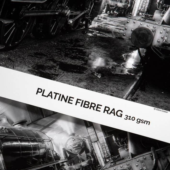
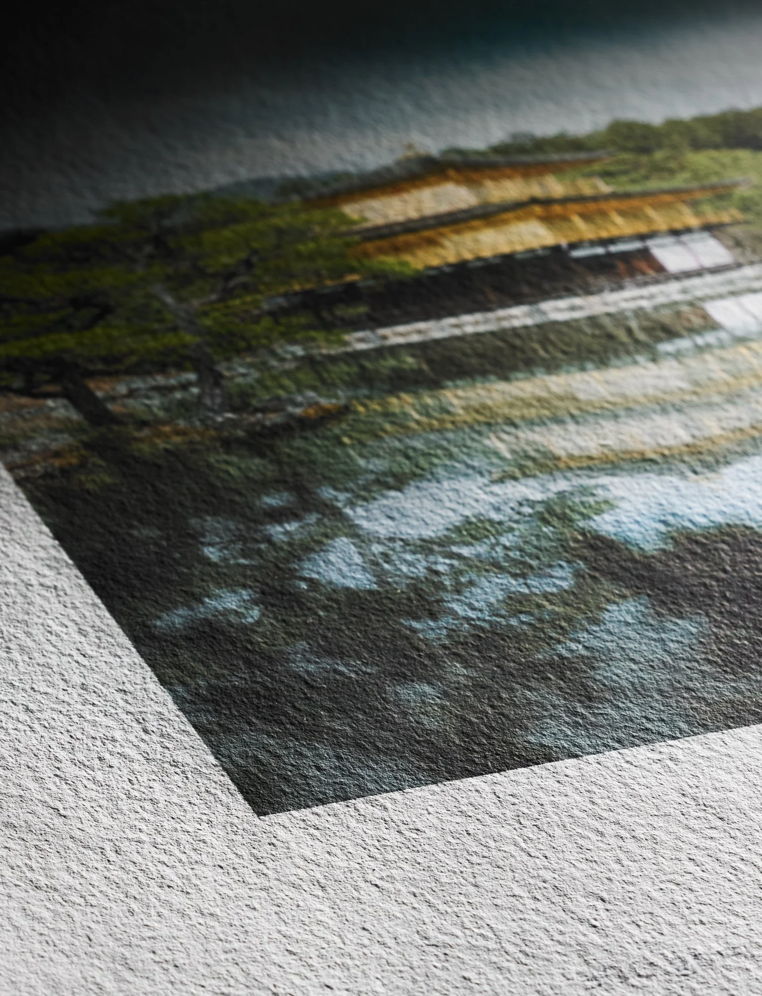
Second, let's talk about white point, what it refers to and how it can impact your prints. A paper's white point refers to how white a paper's base appears to be and is judged on a gradient from cool whites to warm whites. Due to the fact that prints are a reflective medium black is the combination of all colors, and white is the absence of all color—the opposite of a digital screen. Meaning that for prints white areas have no ink, and the paper shows through, which is why the differences in white point can lead to such dramatic differences between two prints. But don’t let that trick you into thinking that a paper’s white point only affects highlights in your print, because the paper’s white point is your base it affects everything from the warmth or coolness of your image, to color reproduction, contrast, and even the perceived sharpness of your print. Papers with a cooler white point, often referred to as bright white papers, have a clean, modern, high-impact appearance. They work great for high contrast images, where a stark difference between your highlights and shadows can lead to a sharper looking final print. Warmer toned papers are often referred to as natural tone papers, have a softer, more artistic appearance. The off white tone leads to a more subtle difference between an images shadows and highlights, leading to lower contrast, and less perceived sharpness in the final print. In general, bright white papers work best for commercial and editorial prints where a high contrast contemporary feel is desired, and more natural toned papers are best for fine art prints where a more artistic and painterly look is desired.
Dmax
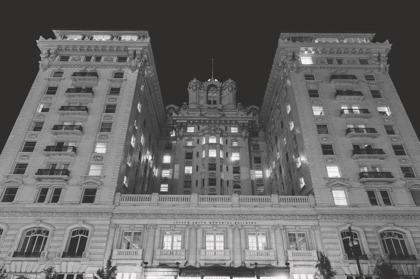
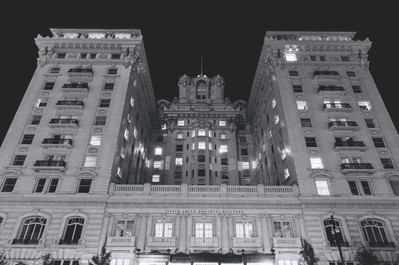
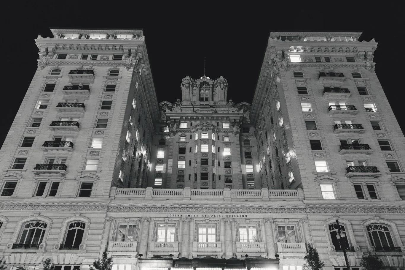
Now that we have covered a paper's white point, let's go over a paper's black point or Dmax. Dmax is a term that is tossed around a lot by paper companies in their advertising—often claiming that their paper has the best Dmax on the market. But, what does Dmax actually refer to, and how does it affect a print? Dmax refers to the maximum density of the blackest black that a specific paper can produce. Similar to how each paper has a unique white point, every paper also has a unique black point which can affect almost every aspect of a print from contrast, to colors, and perceived sharpness. A paper’s Dmax is affected the most by its finish with glossy papers having the highest Dmax, and matte papers having a lower Dmax. Papers with a higher Dmax will have deeper black tones, leading to higher contrast, a sharper appearance, and a greater sense of depth in the final print. Paper with a lower Dmax will have lighter black tones, lower contrast, less perceived sharpness, and a flatter overall look. Papers with a higher Dmax will provide a wider range of back tones, allowing for more separation in deep shadows, whereas papers with a lower Dmax will blend those darker tones together leading to a coherent and artistic appearance. Despite what the advertisements may suggest, a higher Dmax is not always better, and by understanding Dmax, you can use a paper that will best suit your work best.
Paper Finish
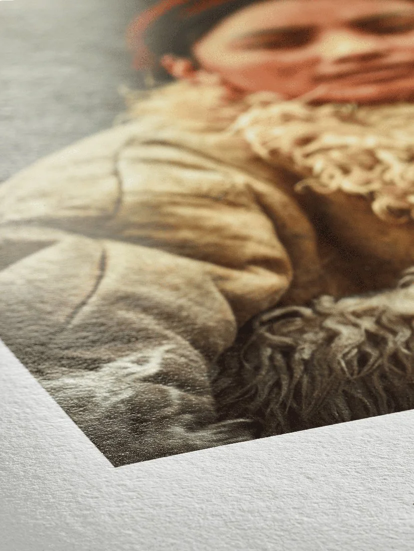
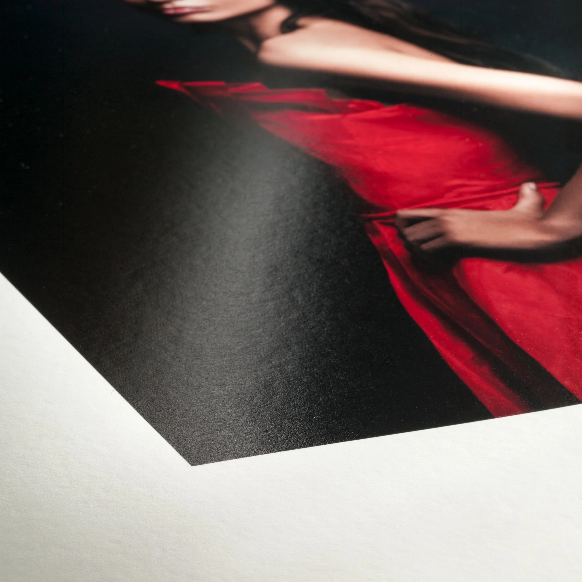
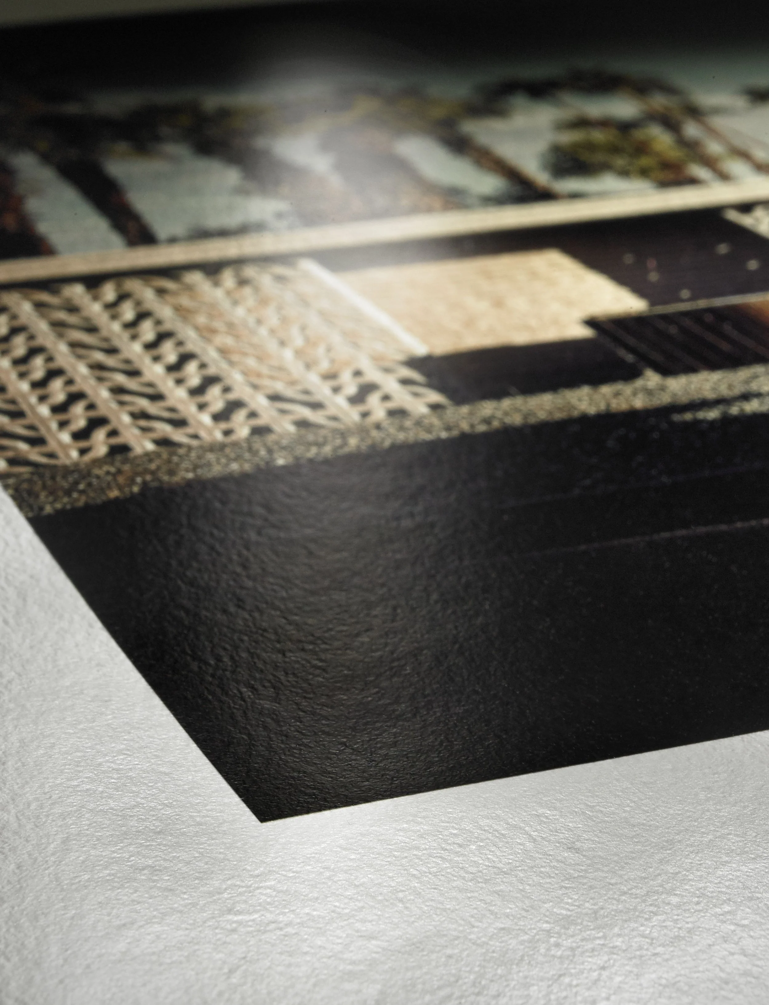
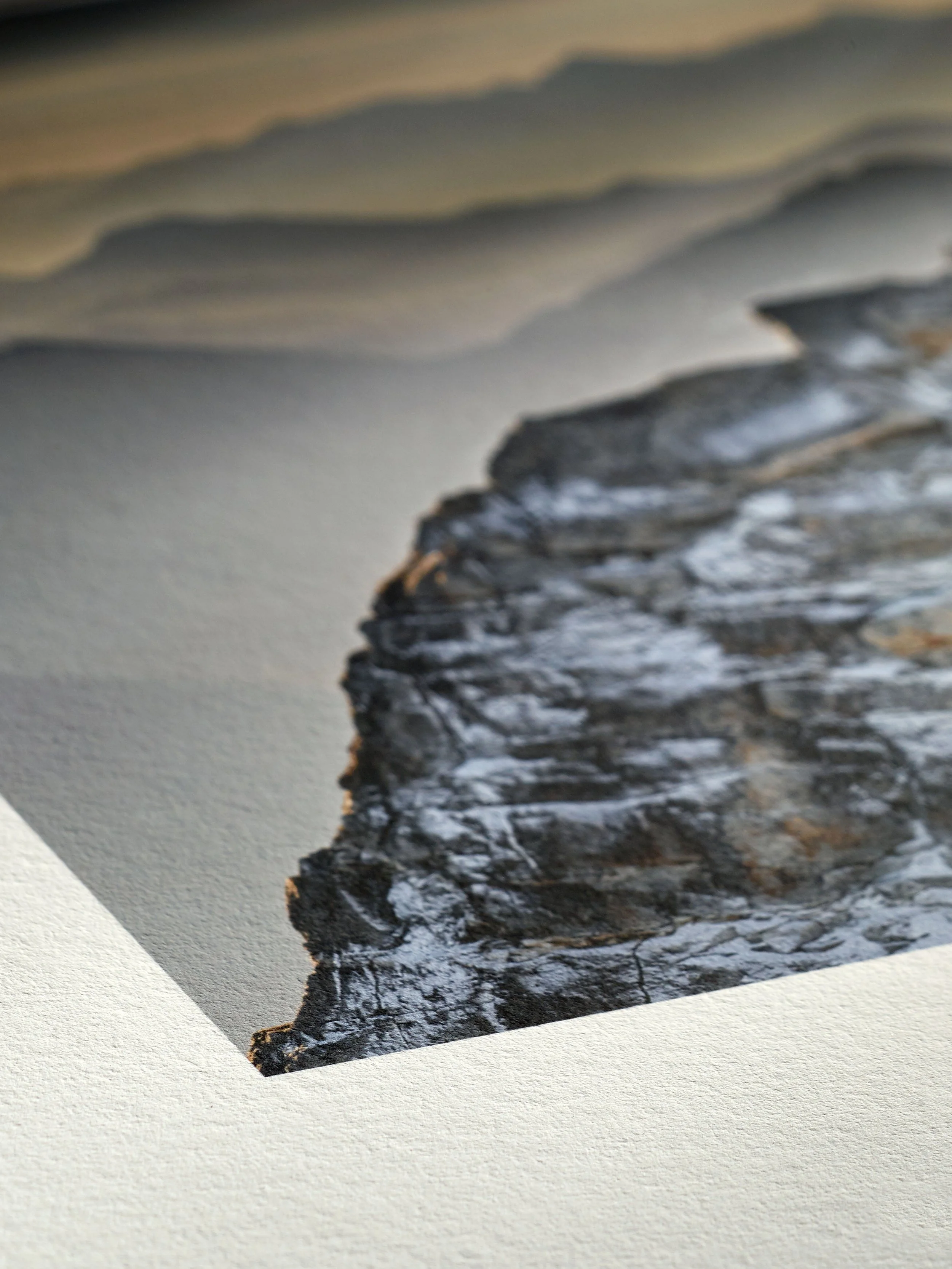
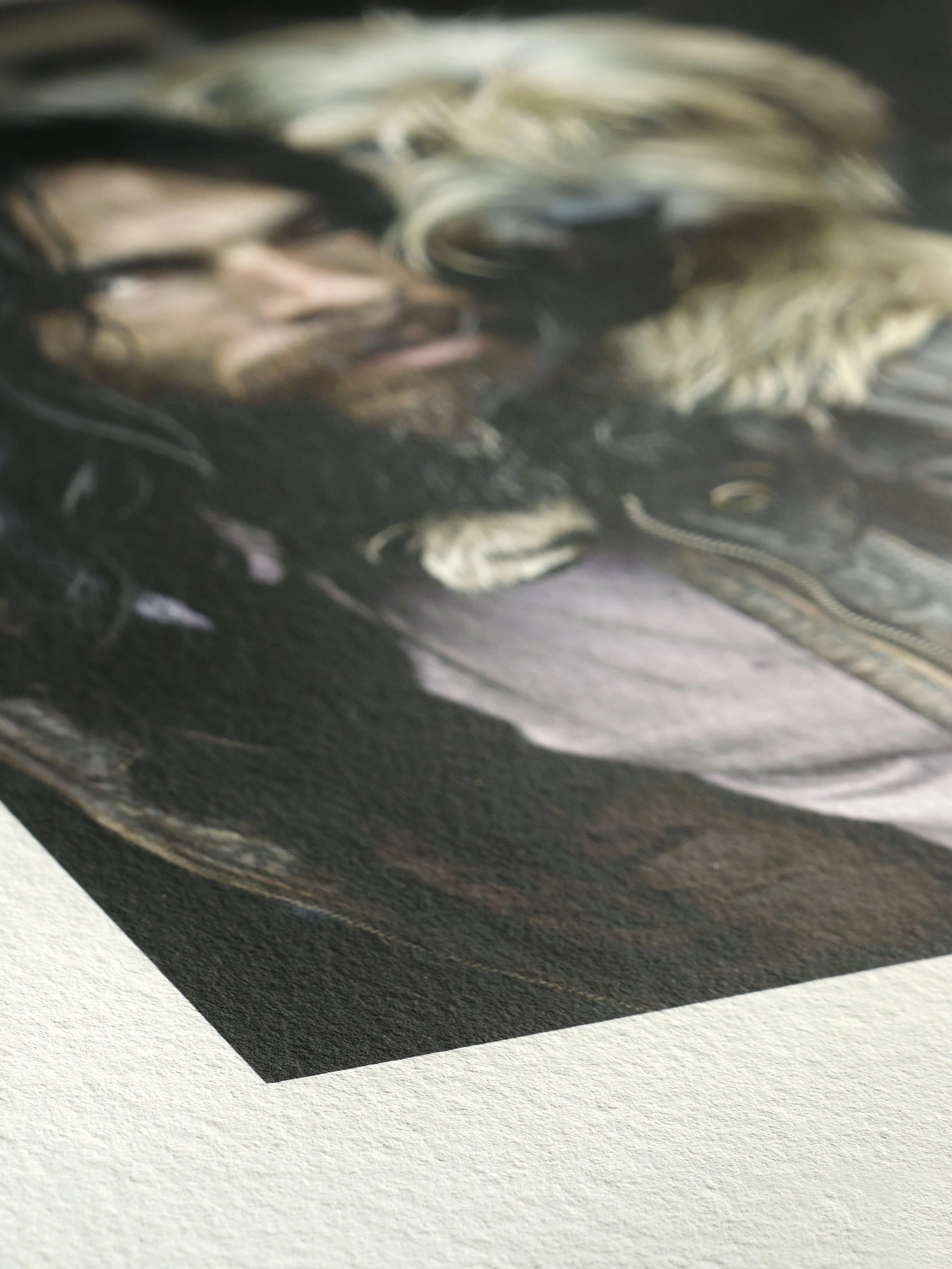
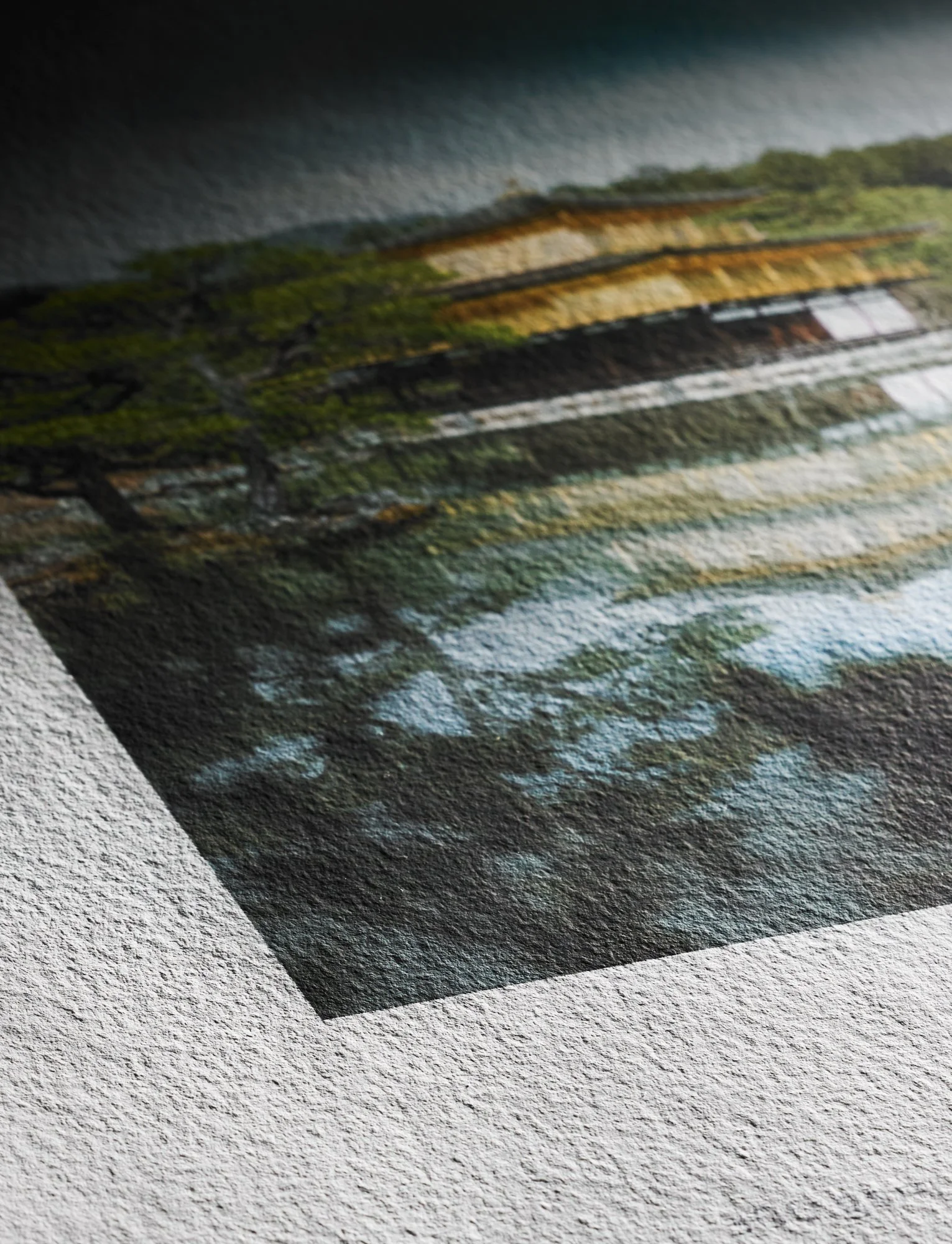
The last thing I will cover before going through some examples is paper finishes or surfaces. There are many different paper finishes ranging from glossy, luster, satin, velvet, and more. Each finish is unique and has a significant impact on the appearance and mood of the final print, but it can also be quite confusing distinguishing between them. This is partly due to the fact that different paper companies use these terms in different ways, a Hahnemuhle paper with a satin finish might not be the same as a Canson paper with a satin finish and so on and so forth. Due to this fact, my best advice is to do your research and if possible look at these papers in person by getting sample packs if you plan to do your own printing or visit your local printing shop to look through their samples. This allows you to compare one paper’s finish to another with your own eyes and not judge them simply by their label.
That said, there are some general guidelines that most paper companies follow especially in terms of Photo Papers and you can glean information based on the label provided. In general, paper companies label their paper’s finish in terms of how glossy or reflective the finish is and whether it is textured or not. With high gloss or gloss papers being the most reflective they are generally smooth and offer high contrast and vivid colors. Semi-gloss papers often fall into three categories: luster, pearl, and satin. While all three are quite similar, luster papers are the closest to glossy paper, and generally are smooth papers with a semi-gloss finish. Pearl papers have a similar level of shine to luster papers but have a subtle pebble like texture that makes them distinct. Satin papers have the lowest level of sheen with a fine repeating texture sometimes compared to automotive paint. Finally, you have true matte papers with no sheen that are distinguished solely by their texture. Matte papers range from heavily textured, to finely textured, to smooth. Each finish offers different pros and cons, and every paper has its own unique finish; something I wish to go deeper into in a future post.
Example 1
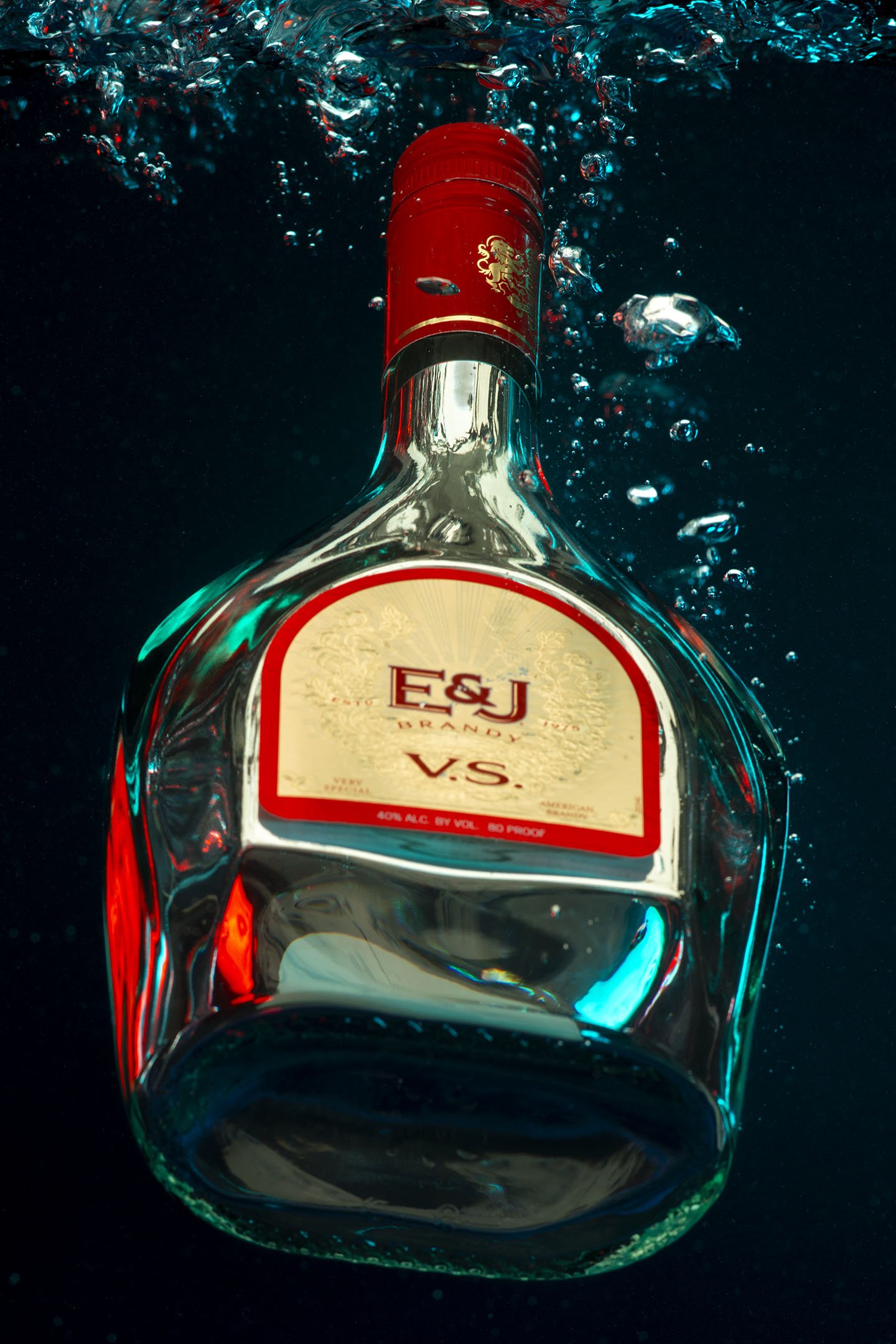
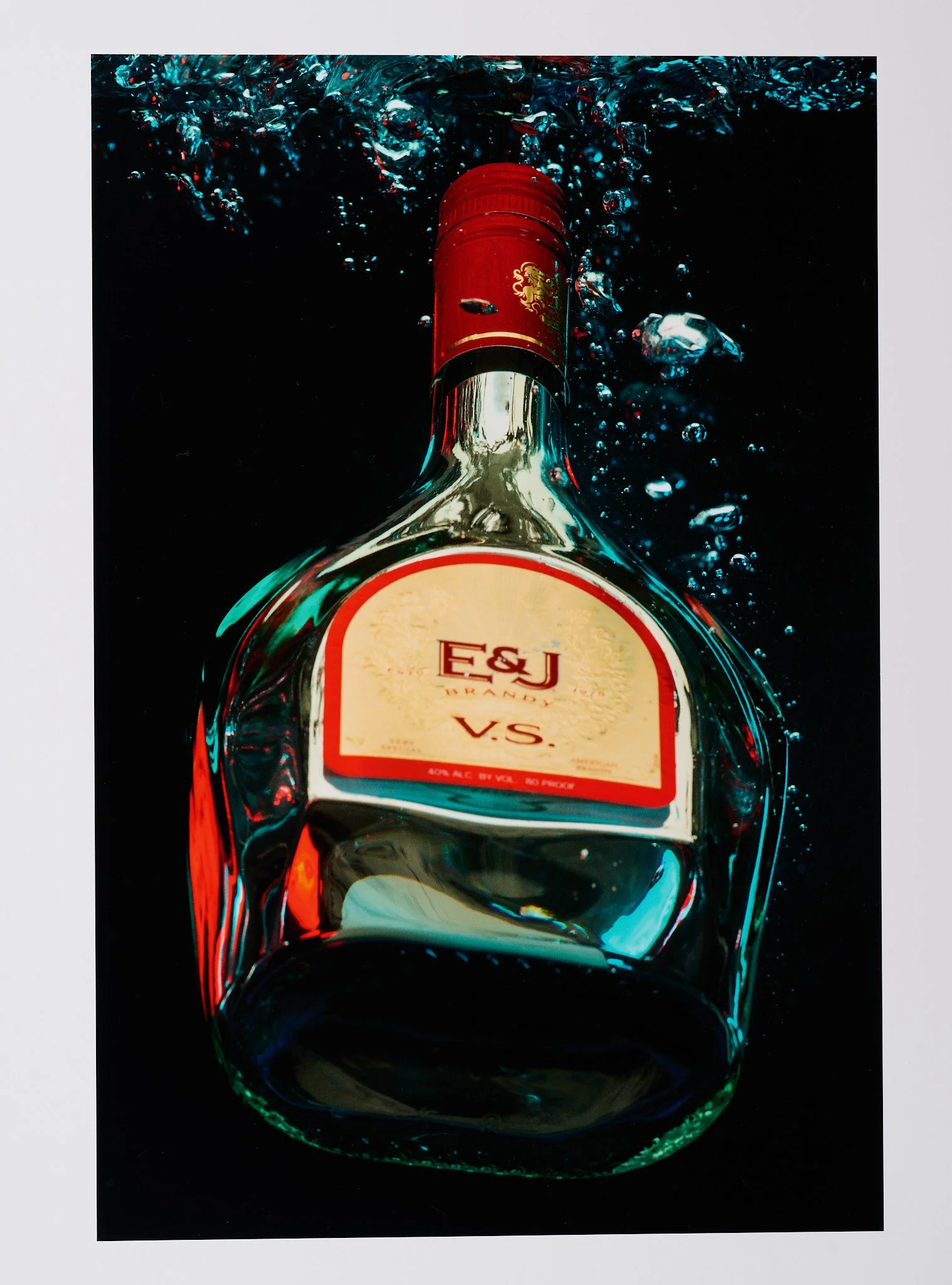
E&J Brandy Splash
Captured with a Phase One XF Camera & an IQ4 digital back.
For our first example let's start with this photograph of an E&J Brandy bottle, submerged underwater. This photograph was taken with a Phase One Camera, and I say that not to brag but to let you know that the full uncompressed file that I will be printing with is as high quality as possible. This online version that I’m showing you is still good, but it doesn’t quite capture the true essence of the photograph. The detail, dynamic range, and depth of field all work together to create a real sense of shape and three dimensionality to the bottle, and the water bubbles appear to be coming right out of the screen. It is this sense of depth and shape that we will try to enhance with our print, and choosing the right paper will be a major part of that.
Something not talked about enough in the online printing discourse is intent, meaning what is the final intent for a print. Is it going to be framed and hung in a gallery, sold as a limited edition print, mounted to gator board and hung in an office hallway, or maybe just pinned to the wall as a poster. The final intent of a print can and should influence what paper you choose. For this example let say that we are printing for an E&J Brandy advertisement campaign. This means we should prioritize durability over archival quality, and more cost effective paper over unique stylized papers. To achieve this we should focus on Photo Papers, but we shouldn’t totally rule out Fine Art Papers, because if a Fine Art Paper can stand out significantly in terms of overall print quality then it might be worth the extra cost. Taking the time to think through your project and the intent behind your print is an important step that many people overlook, but it's important for you or your print lab to understand so the right decisions can be made.
Now let's go over the other major factors that influence a print, white point, Dmax, and paper finish. While test prints are important for matching the perfect paper to your image, understanding your image, the intent of the final print, and these three factors can help you narrow down what papers you want to try and what papers you can avoid. Starting with white point in regard to the E&J Bottle, I know that I want a bright white paper to enhance the contrast and color, while maintaining a crisp sharp look to the overall image. A warm toned paper on the other hand could potentially lower the contrast of the image, leading to a softer appearance that conflicts with the boldness this photograph has. In terms of black point or Dmax this image requires a high Dmax paper. The high contrast and striking tones of this photograph, requires a paper that can match that aesthetic. While it can be challenging to see in the compressed photo that I’m showing there is also a significant amount of shadow detail in the background with the water and the bubbles, so maintaining shadow detail is important. Also as discussed, making a print that has a real three dimensional look is a top priority, and choosing a paper with a high Dmax is critical to achieving this. Finally when it comes to paper finish we want a finish that matches the look of our image and helps meet the goals of our white point and Dmax that we just discussed. In terms of subject matter this image consists of a glass bottle in water, both items that in real life have a reflective quality to them. This is something that we will want to match with our final print. All of this together leads me to believe that a high gloss or luster paper would be our best option. So next lets look at some examples of these types of papers.
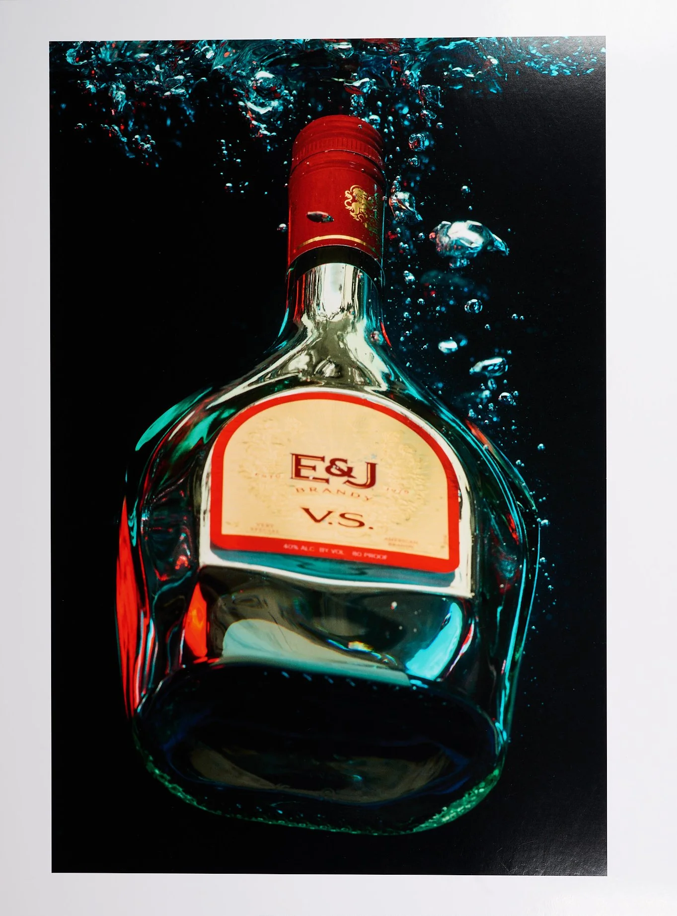
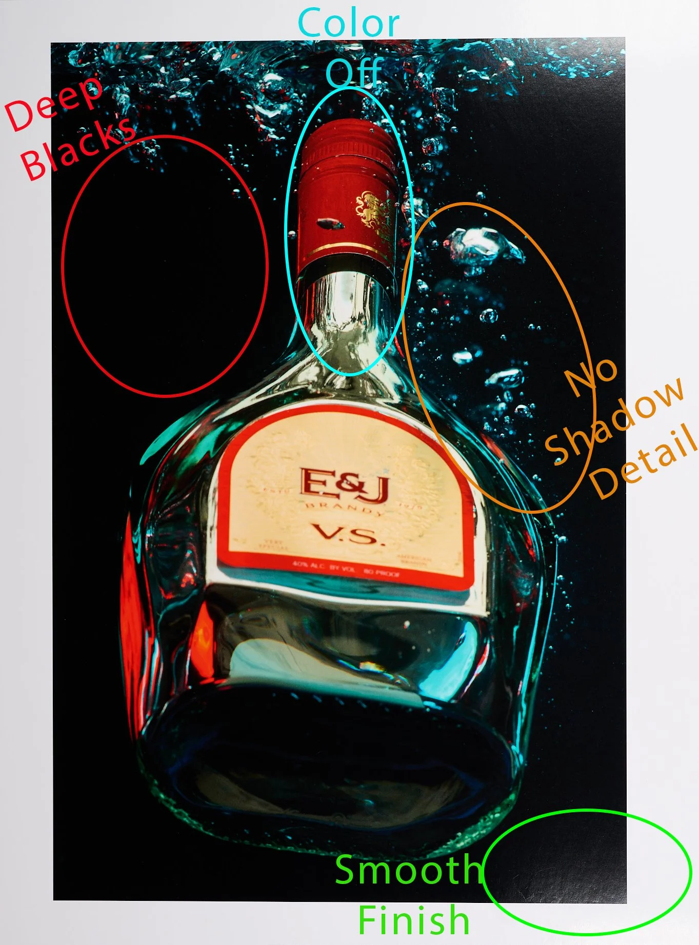
To start we have the Arista Glossy Paper, a middle of the line RC Glossy paper with a bright white base. The first thing I notice with this print is how deep the blacks are, thanks to the high Dmax of glossy papers. This can be seen in the background especially to the left of the bottle where there are fewer bubbles. These deep blacks add contrast and help shape to the bottle and the bubbles giving them a more three dimensional aspect. Sadly in some areas our blacks are too deep and we are losing shadow detail in the water and the bubbles. This is most likely due to the limited dynamic range that all prints suffer compared to a digital screen, and it will be curious to see if any paper can match the deep blacks while maintaining enough detail in the water. Finally the reds in the print are slightly off, though in a different way than is portrayed through the photographs that you are seeing. While this might be hard to discern digitally, in print that I am looking at with my eyes the reds are a little too magenta and slightly under saturated compared to the digital photograph. This leads the bottle’s top to look flat and not pop as intended. So my initial impressions of this paper are relatively positive, the Arista Glossy paper provides a gloss surface that matches the style of photograph that we have while providing deep blacks, lending the print a sharp high contrast appearance. While we lose a little bit of shadow detail in the water, the added contrast is potentially worth the trade off. Finally, the colors are slightly off but this could potentially be fixed with some further edits. Next, let’s see what a luster print looks like.
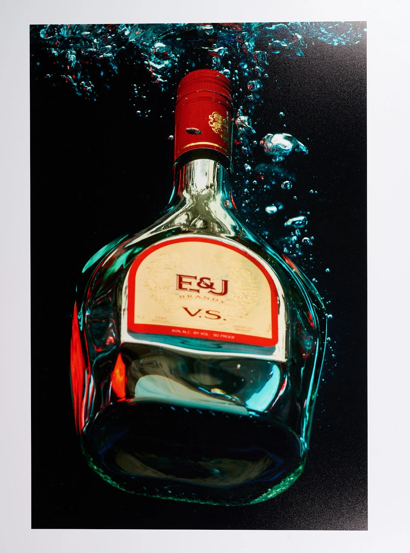
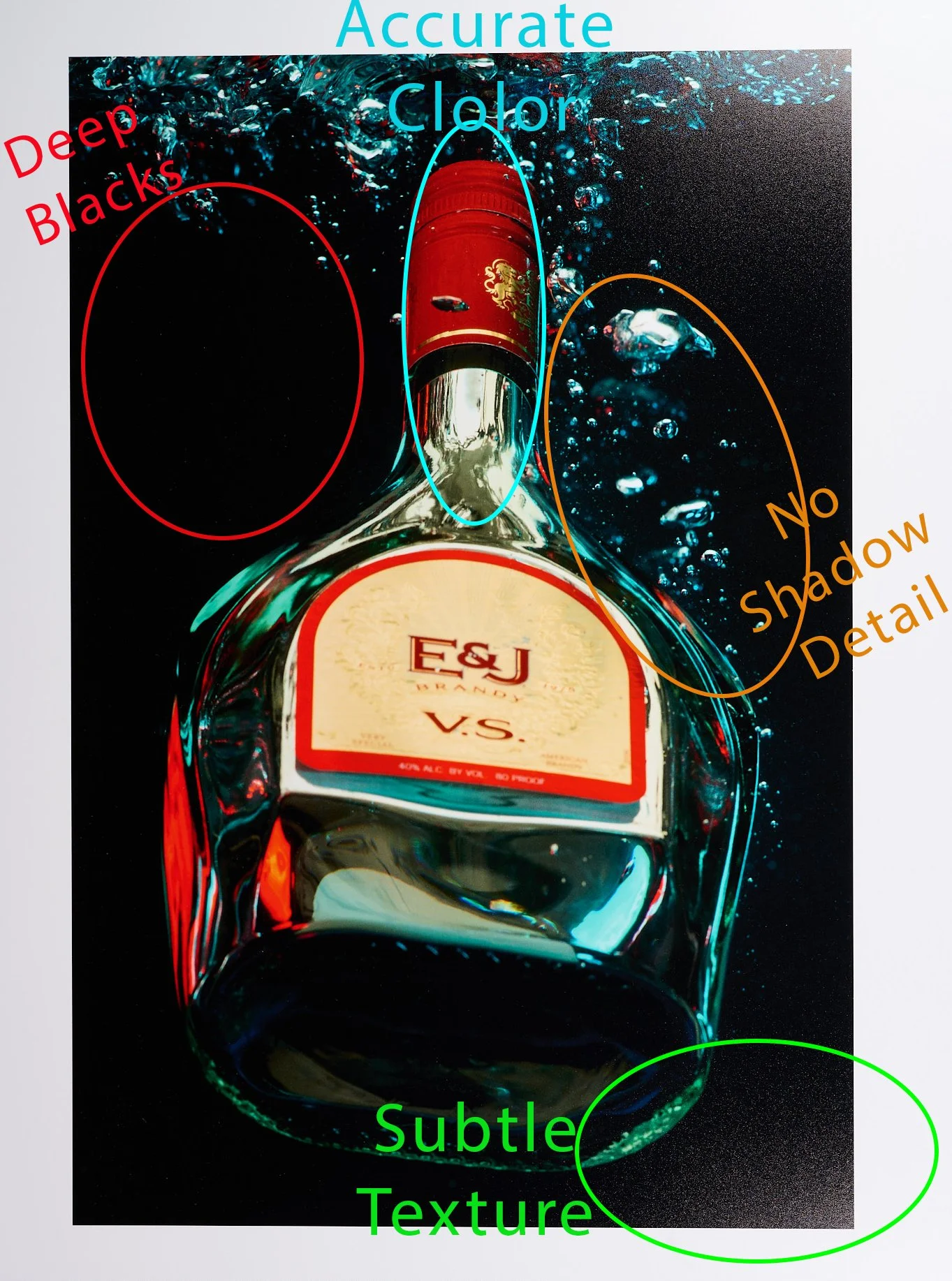
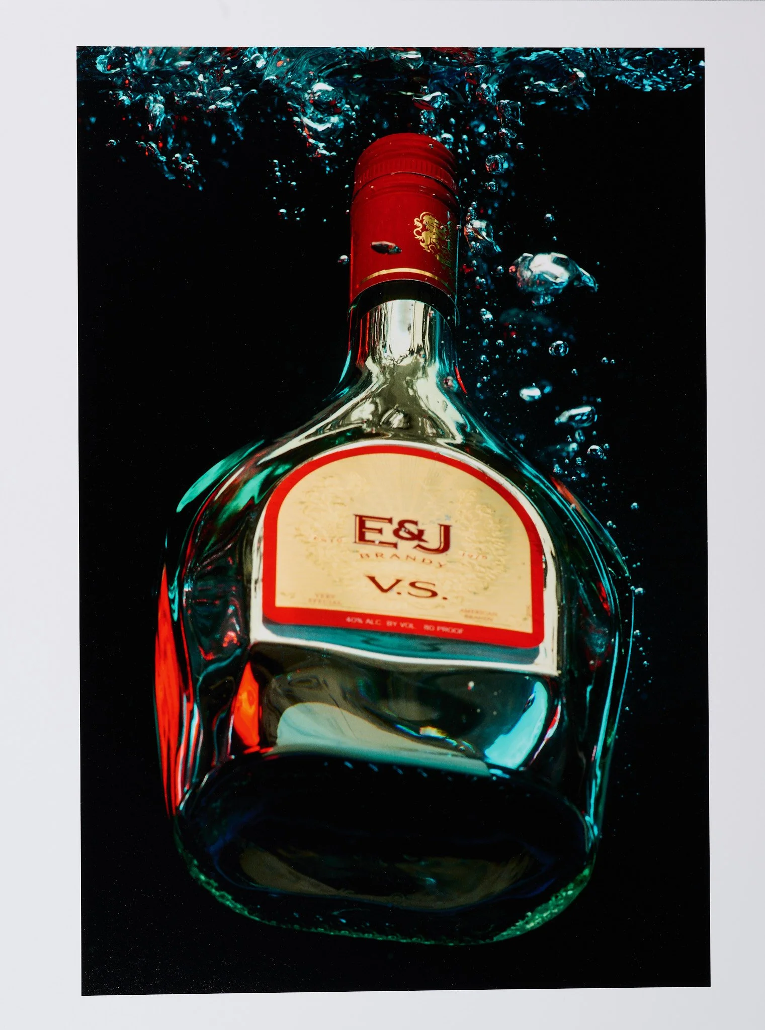
The following print was done on Moab Lasal Exhibition Luster, a higher end Photo Luster Paper. I decided to go with this paper next to test the difference between a photo gloss paper, and photo luster paper. Second, I was curious about the quality difference between the two papers; with Moab Exhibition Luster being double the cost of Arista Glossy, I wanted to see if there was a noticeable quality difference between the two papers.
When comparing the physical characteristics of both papers, Moab’s Exhibition Luster is a heavier paper at 300gsm, and Arista Glossy at 252gsm and you can feel the difference. While subjective, I personally like the heavier feel of Moab’s Exhibition Luster, and the slight stiffness it has compared to the floppiness of the Arista Glossy paper. While both are considered bright white papers the Exhibition Luster is definitely whiter, leading to an overall brighter image, and greater apparent contrast. In terms of paper finish you can definitely see a subtle texture on the Exhibition Luster while the Arista Glossy paper remains smooth. That said, in terms of overall sheen I struggle to see a significant difference between the two, especially in printed areas they look near identical and only in the white borders can I easily spot the extra sheen that the glossy paper has. Looking at the two sets of provided photographs you may struggle to see many differences between the two papers besides the texture visible on the Exhibition Luster, so next let me go through some of the more subtle print differences.
To start, let me say that these two prints came out quite similar in overall quality, despite the price difference between these two papers, but there are a few positive changes that the Moab Exhibition Luster brings. In terms of Dmax these two papers are nearly identical, with Exhibition Luster also having a super high black point leading to deep blacks in the background and a high contrast look. The downside is also identical with the loss of shadow detail, in these deep black areas. If you scroll up to the original file you will see a slight blue to black gradient in the background that is lost in these prints. The main difference between the two is in the color, especially the reds you can see significant improvement. Exhibition Luster has brighter, more saturated colors that more accurately represent the original. This bump in saturation, helps separate the bottle from the background giving it more presence on the page. Finlay there is a small improvement in sharpness with the Exhibition Luster paper compared to the Arista Glossy paper. I would guess this is perceived sharpness due to the brighter white base and saturated color, rather than an actual physical improvement of the print; however it is noticeable in the finer details like the air bubble and bottle cap. Overall I like Moab Lasal Exhibition Luster more than Arista Glossy, and there are noticeable improvements in the final print, but the question of price does linger; is it worth paying twice as much for these subtle differences?
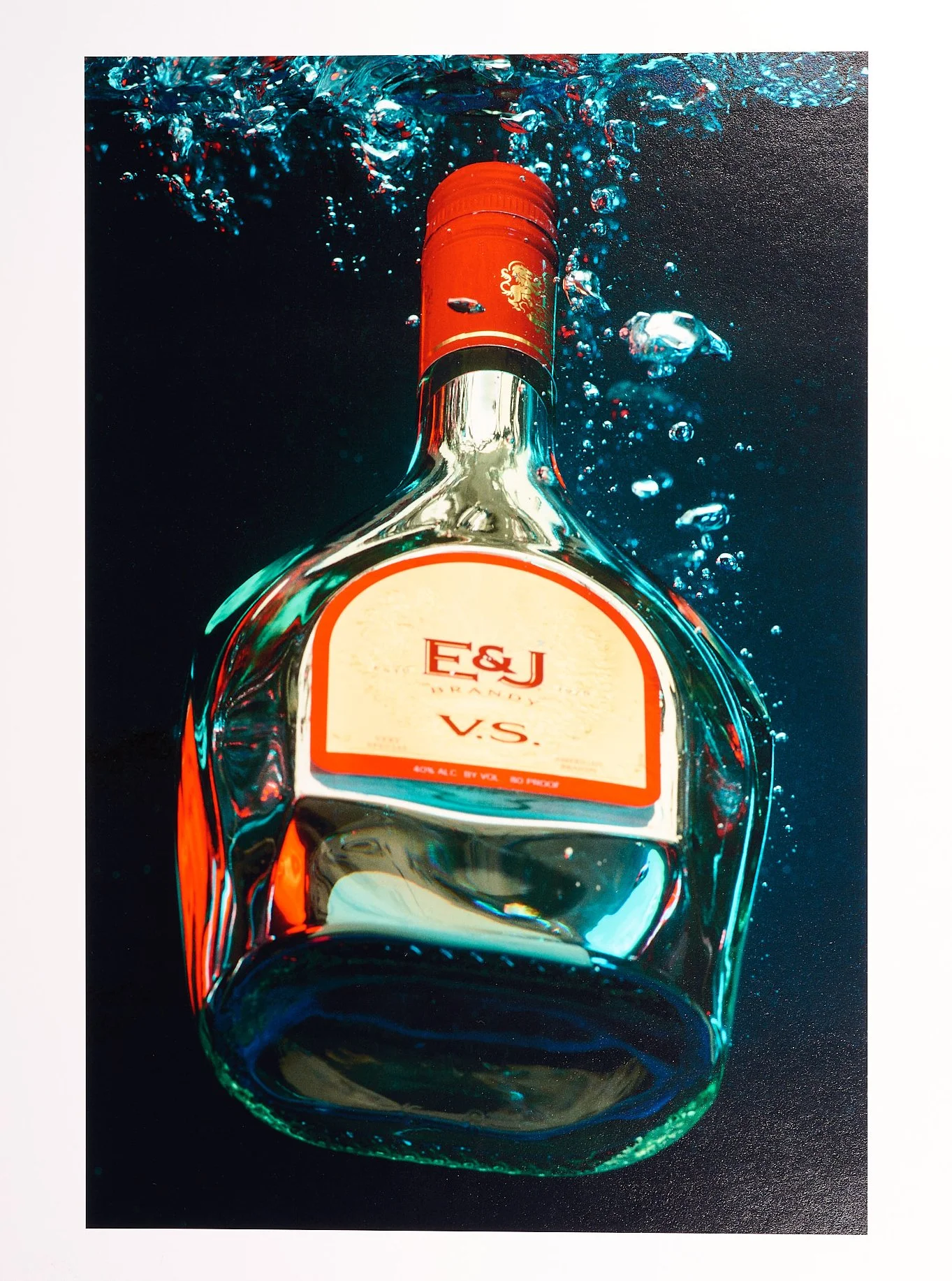
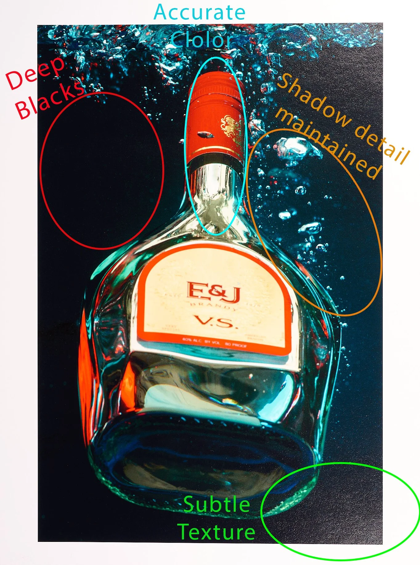
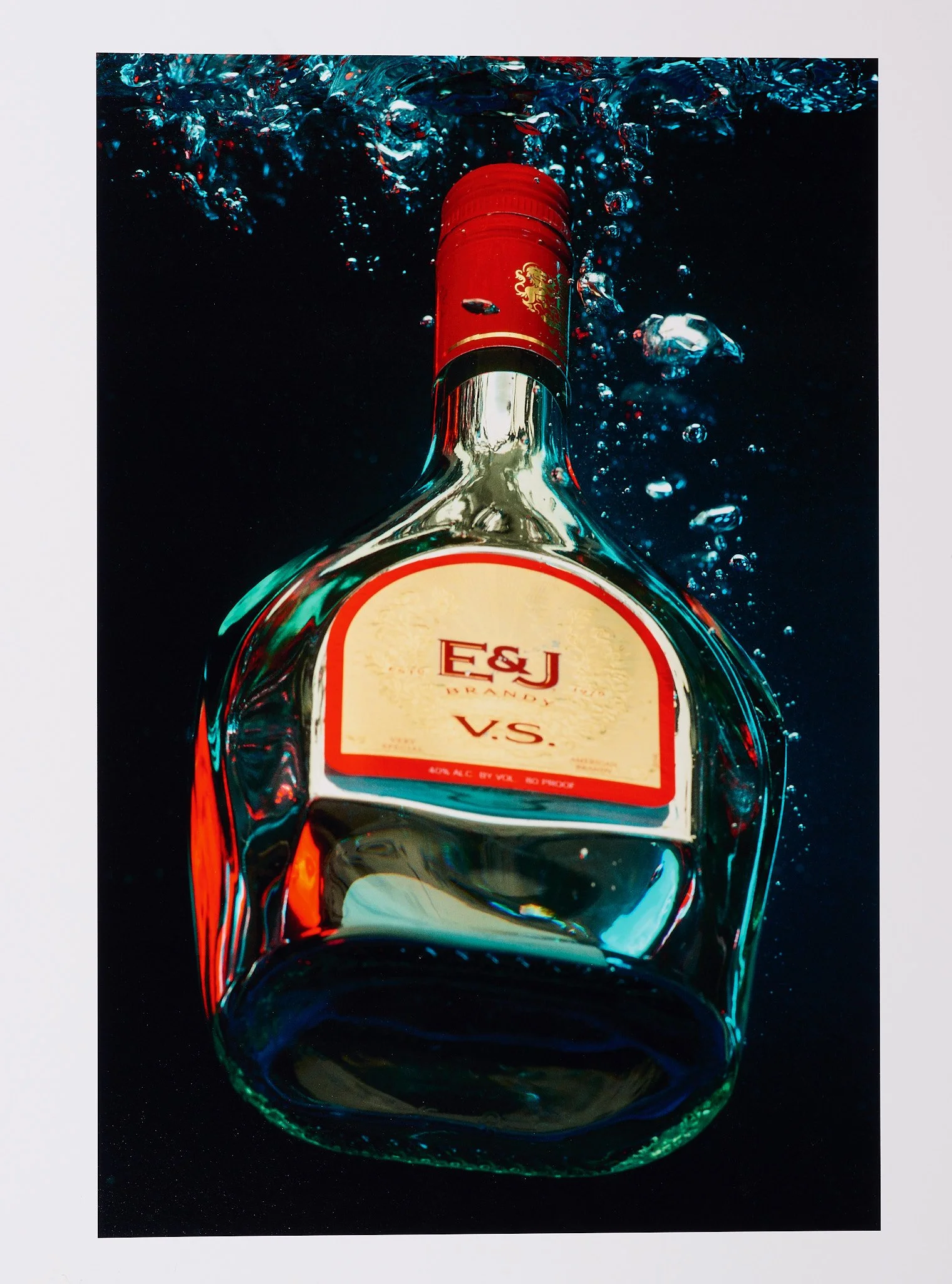
Finally lets take a look at a fine art paper, with Canson Platine Fiber Rag. At 310gsm Canson Platine is a fiber based paper with 100% cotton base, a satin finish, and is advertised to have an extremely high Dmax. I decided to go with this paper next because it is a personal favorite, and when reviewing this image for print it instantly came to mind. When comparing the physical characteristics of the papers Canson Platine is the heaviest at 310gsm, and with a cotton fiber base it is the most rigid of the three papers. While advertised as a bright white paper, Canson Platine is much closer to a natural toned paper when compared to Arista Glossy and Moab Lasal Exhibition Luster, leading to a slightly more warm toned print. As for the coating Canson Platine is listed as “Satin” leading it to have the lowest amount of shine compared to the other two. It also has a slight texture similar to Moab Lasal Exhibition Luster. The Canson Platine Fiber Rag is definitely the most unique paper among the three we are testing today, so let's see how the actual print compares.
When comparing this print to the other two papers the difference is instantly recognizable, with the Platine Fiber Rag maintaining the shadow details in the background. In the two photo papers, Arista Glossy and Moab Lasal Exhibition Luster the background is a deep black which does increase the overall contrast of the image, but isn’t accurate to the original file. With Canson Platine Fiber Rag the paper’s increased dynamic range and the high Dmax it allows the original dark blue gradient tones to be maintained, matching the original look more closely and leading to a greater sense of depth in the final print. Surprisingly the Canson Platine also looks the brightest in the printed areas despite being closest to a natural toned paper. This is most noticeable in the reds, with the bottle cap being even brighter than the Moab Lasal Exhibition Luster, leading to more separation and a more three dimensional appearance. The only negative that I see with the Canson Platine is the Satin finish doesn’t have the high level of shine that the Arista Glossy and Moab Exhibition Luster had, leading to a less realistic glassy appearance. Overall the Canson Platine provided the most accurate print, and was able to match the original photograph the closest. With the paper's high dynamic range and incredible Dmax it provided a sharp, color accurate print, that in my opinion gave the greatest sense of depth to the final print; at the cost of losing the glassy shine I wanted in order to match the characteristics of a glass bottle. Cost wise Canson Platine is just a little more expensive than Moab Exhibition Luster, also meaning more than double the cost of the Arista Glossy paper.
So what does this all mean in the end. Well in terms of paper quality and getting the best possible print the Canson Platine paper would be the best choice among the three that we tested. While both the Arista Glossy, and Moab Lasal Exhibition Luster provided decent prints, neither one could match the dynamic range or color accuracy of a fine art paper like Canson Platine. That said going back to the idea of intent, or the purpose this print will be used for which of these options would be best. Just as a reminder the theoretical intent is to print this image for an ad campaign. So while the Canson Platine does provide the best print it is also the most expensive paper, more than double the cost of the Arista Glossy paper. On the other hand the Arista Glossy, while cheap provides a nice high gloss sheen, but sadly loses shadow detail and is the least color accurate of all three papers. This is easily seen in the reds with the bottle cap looking dull, leading to a flat unimpressive final print. Finlay Moab Lasal Exhibition Luster, fits nicely in the middle, with much better color accuracy than the Arista, but it doesn’t have the dynamic range to maintain full shadow detail, like the Canson Platine. My final thoughts are that if the color accuracy of the Arista Glossy 252 paper can be fixed with some further edits and soft proofing, than for an advertisement campaign, the money saved would be worth the loss of shadow detail. However if the Arista Glossy paper isn’t capable of reproducing the reds accurately, then going for the Canson Platine Fiber Rag would be worth it. For only a slight cost increase over the Moab Lasal Exhibition Luster you get a superior print without further edits, that would allow the bottle to be shown off in the best possible way.